
There are a million ways to write a CTA, but we found a CTA formula on campsite that drove more conversions.
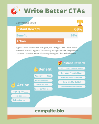
A good call to action is like a magnet, the stronger the CTA the more interest it attracts. A good CTA is strong enough to make the potential customer complete a task all the way through to the desired "action".
We analyzed 13,231 form interactions from the last 30 days and one jumped off the page.
With a form link on campsite you have two unique opportunities to use a CTA, the button label and the submit button. Once a form is expanded the button label becomes a header or title and it also has implications on form start rates. See Eye Candy 🍬
Customizing one or both is a no-brainer so ditch the default “Send” label and see more conversions!
Table of Contents
Table of Contents
👌 Good: Action
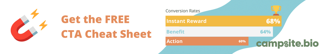
The default "Send" button label is easy to beat, and something like "Sign up" or "Join” or "Subscribe" does convert better.
We saw a 60.32% form conversion for similar types of CTAs, whereas the defalt "send" only got a 53.56% conversion rate, a 12.62% increase.
👍 Better: Benefit or Reward
Mentioning the benefit or reward they will get from something like a newsletter resonates even more with your visitors and we have the data to prove it. Here is an example of that CTA: “Sign up for Weekly Support & Resources!”
We saw a 64.75%% completion rate for similar CTAs.
🤓 WARNING Nerdy math: Compared to a generic CTA this is the clear winner! Based on a 95% significance g-test, hypothetically if you ran this experiment over and over, 95% of the time the resulting proportion would be a relative lift between 5.84% and 21.16%.
🤯 BEST: Instant Reward
This tactic is called a lead magnet and it makes complete sense when you think about it, any personal info given up by a customer begs the question, "what's in it for me?", or "Why now?". An instant reward clearly tells them what they get for their info. Some examples of these types of lead magnets are.
- Discounts
- Early or exclusive access
- eBooks, cheat sheets, guides, white papers
- Free shipping
- Fun quizzes or surveys
- Infographics
- Webinars
Link LABEL: FREE eBook: "5 Psychology Principles To Improve Your Experience."
BUTTON text: Get my free eBook
We observed a 68.31% completion rate for similar CTAs.
🤓 More Nerdy math: Compared to a generic CTA this is the clear winner! Hypothetically if you ran this experiment over and over, 95% of the time the resulting proportion would be a relative lift up to 25.25%.
Now that's some serious lift!
Bonus Tips
The Sneak Peak 👀
We could have delared this the best CTA, but this is not an evergreen marketing tactic, unless you're a prolific producer of new and novel things. If you haven't yet launched something new, you can always play up that angle.
Link LABEL: “Sign up to get the scoop on the Summer Drop"
This type of CTA magnet had a whopping 72% completion rate!
NOTE: These also had to be great drops and new products that used more marketing magic to pique people's interest.
Eye Candy 🍬
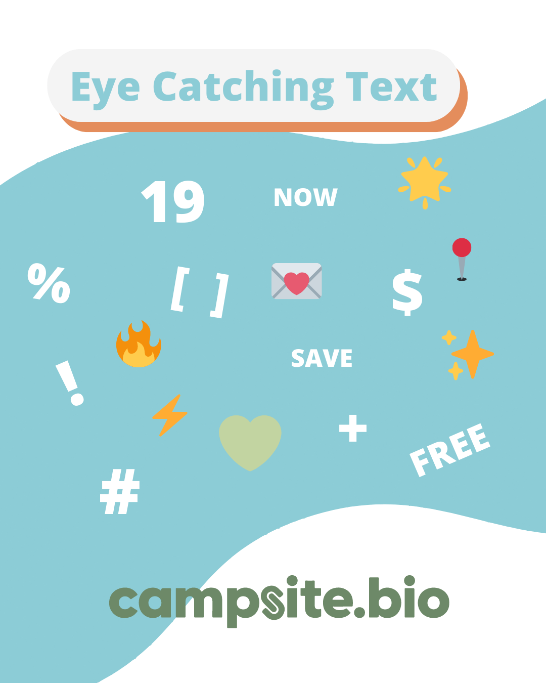
If it fits your brand using emojis is an easy way to catch someone's eye. Symbols and capitalized words, if used appropriately, can also pay off.
When looking at link labels on campsite that included a symbol or emoji, viewable links (either on page load viewpoint or scrolled into view) we saw at least a 15-39% form start rate. The highest non symbol and emoji label only had a 5.8% form start rate.
Customer Considerate 🤔
Be Considerate. Step in your potential customer's shoes, they are more than likely leary of a flooded inbox, so use words like…
- infrequent
- occasional
- weekly
- monthly
Here are some more powerful call to action words, as well as some harmful call to action marketing words.
✅ Words to Use
|
⛔️ Words to avoid
|
⛔️ These words sound too good to be true, and your potential customers know it.
Experiment 🧪
You should never settle with one CTA or combination, it is worth testing multiple options. One simple way to do this is a A/B test. You can run a CTA for a solid week, measure, adjust, and measure again.
Free CTA Cheat Sheet
Download our FREE Cheat Sheet
Did you know Campsite.bio profiles have a 84% CTR in 2022? Give us a try, we are continually designing technology on our micro-site page maker that simply converts.
Free Infographic